
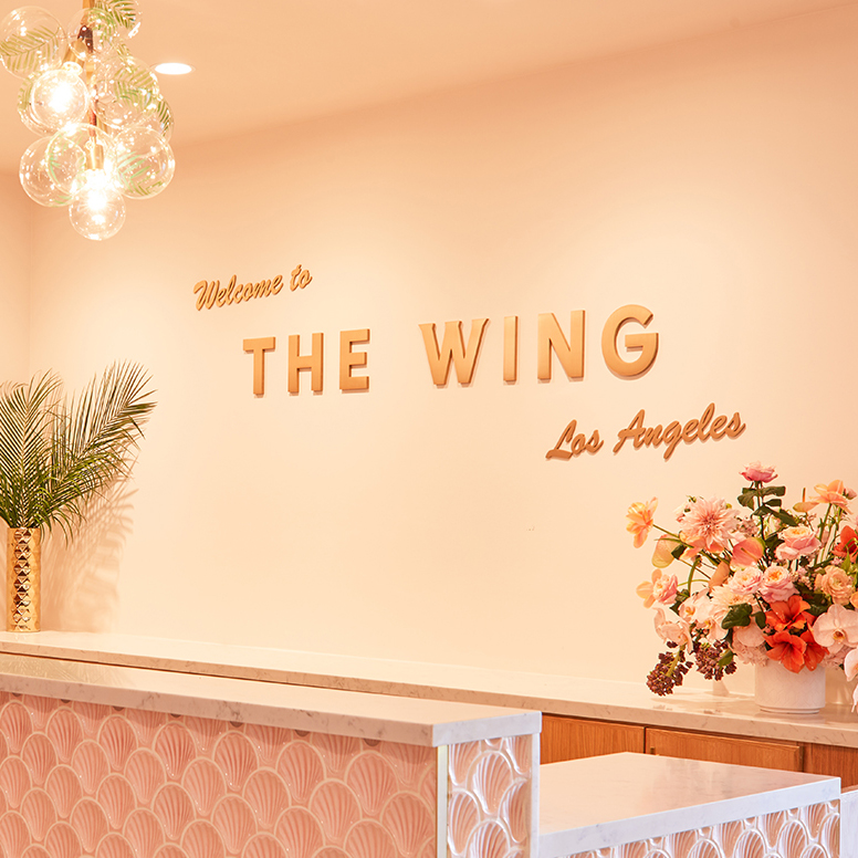
The Wing is a groundbreaking network of co-working spaces designed just for women. Here’s how we worked closely with the creative team at The Wing to bring their brand to life in San Francisco, Los Angeles, and Chicago.

(Images: The Wing)
THE CLIENT
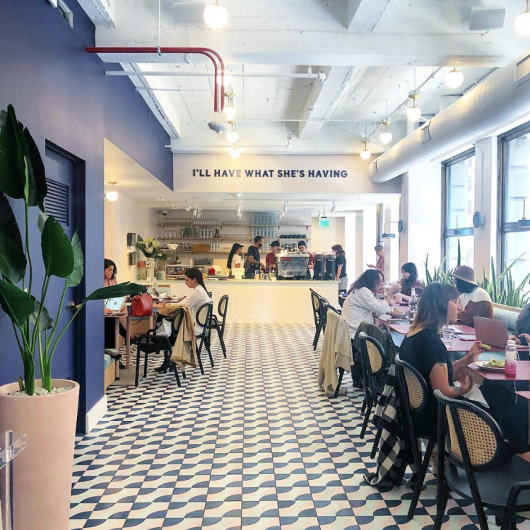
The Wing is a network of co-working spaces designed by women, for women.
The Wing advances women by bringing back the concept of a 1930’s era women’s club, and redefining it for today’s woman. With 6,000 members across its locations—and 30,000 women on an ever-growing wait list, the Wing’s new home in San Francisco, Los Angeles, and Chicago has nonetheless been much anticipated by women in these cities.


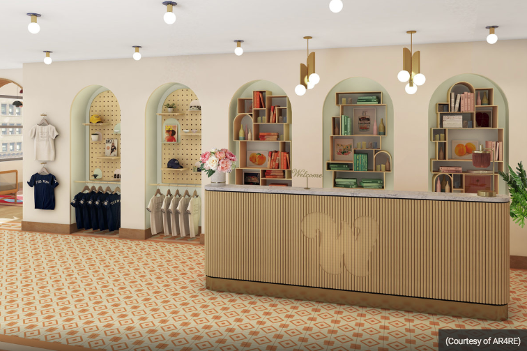
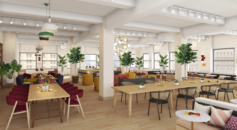
Early renderings of the space. (Images: The Wing)
THE CHALLENGE
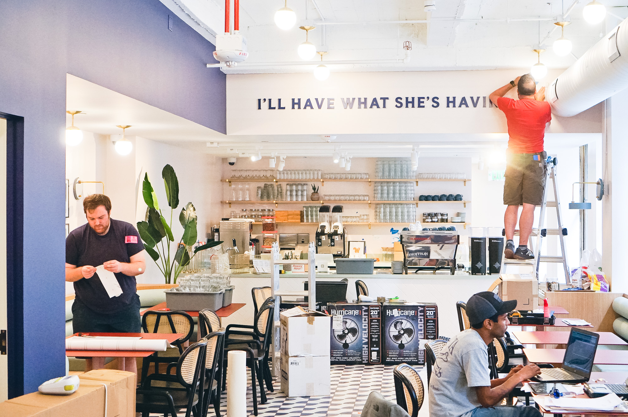
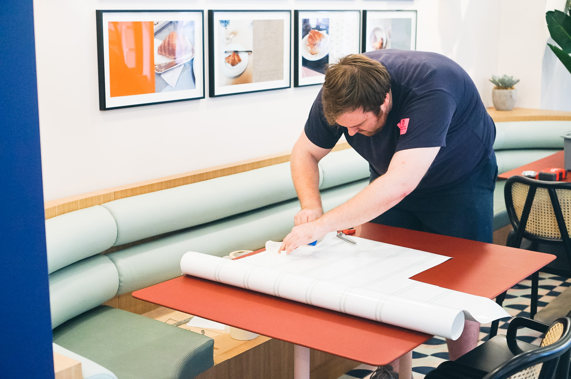
Execute signage that blends seamlessly into the interior, with a critical eye for detail.
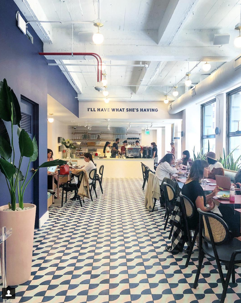
The Wing reached out to us in search for a signage vendor with an obsession for detail. Not only did the signage have to match their existing locations, it had to blend into the dreamlike, Pinterest-worthy space that draws thousands of members in every year. Megan Muir, design manager at The Wing, put it simply: “The best signage is invisible.”


(Images: The Wing)
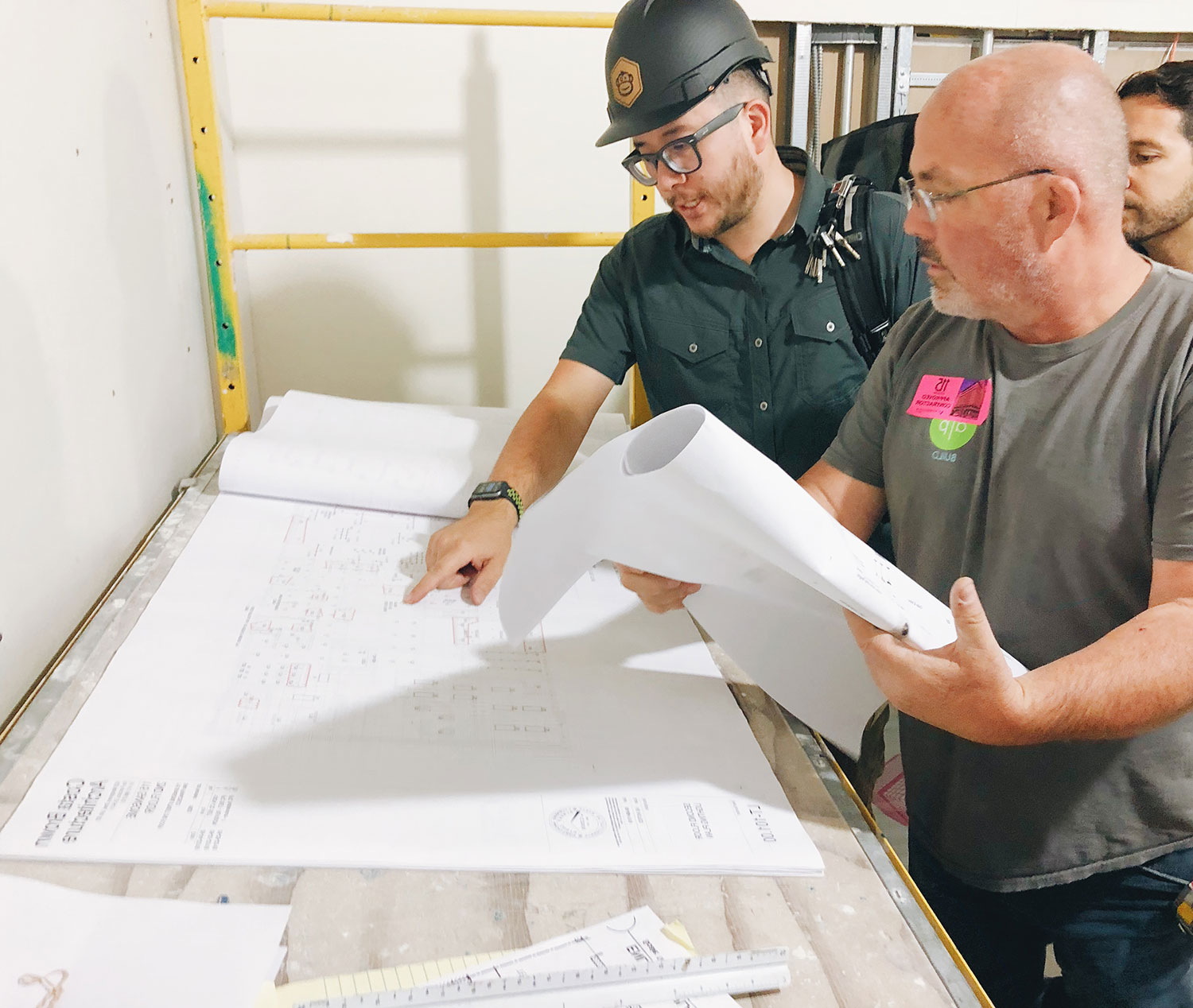
OUR PROCESS
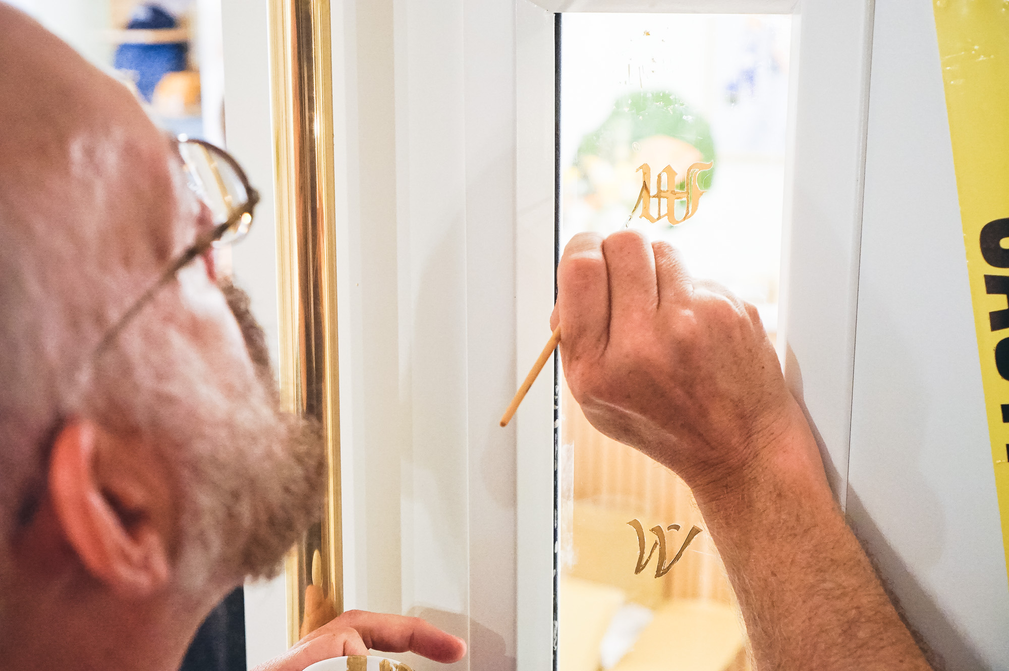
Craft one-of-a-kind signage with methods that span decades of signage history.
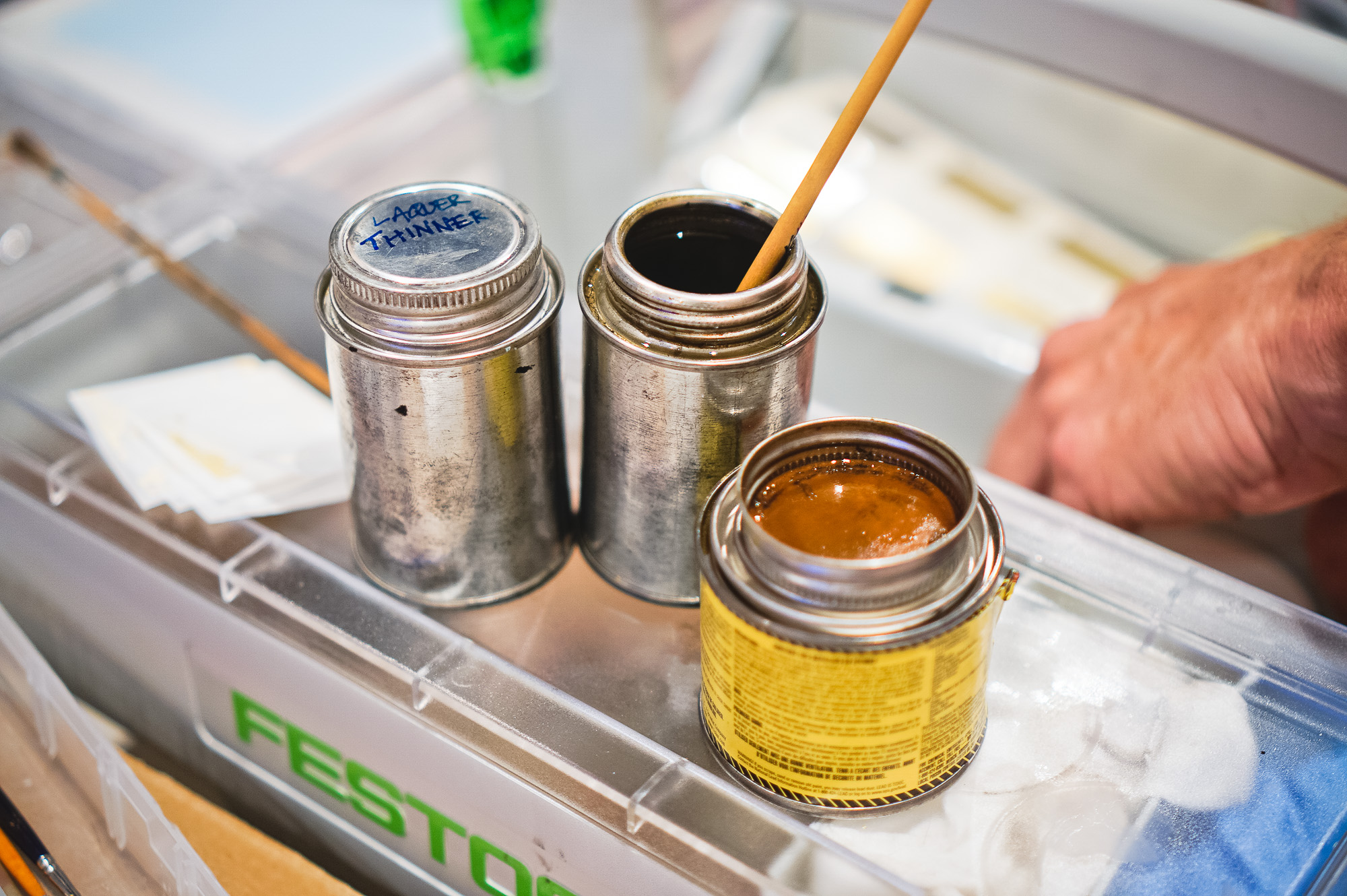
When the creative team at The Wing presented us their ambitious vision, we were inspired to dig deep into our fabrication knowledge to find ways to create signs that pay homage to their roots, yet perfectly match their interior. We used gold leaf gilding techniques from the origins of signmaking to the newest UV light cured printing to achieve Pantone-matched perfection.


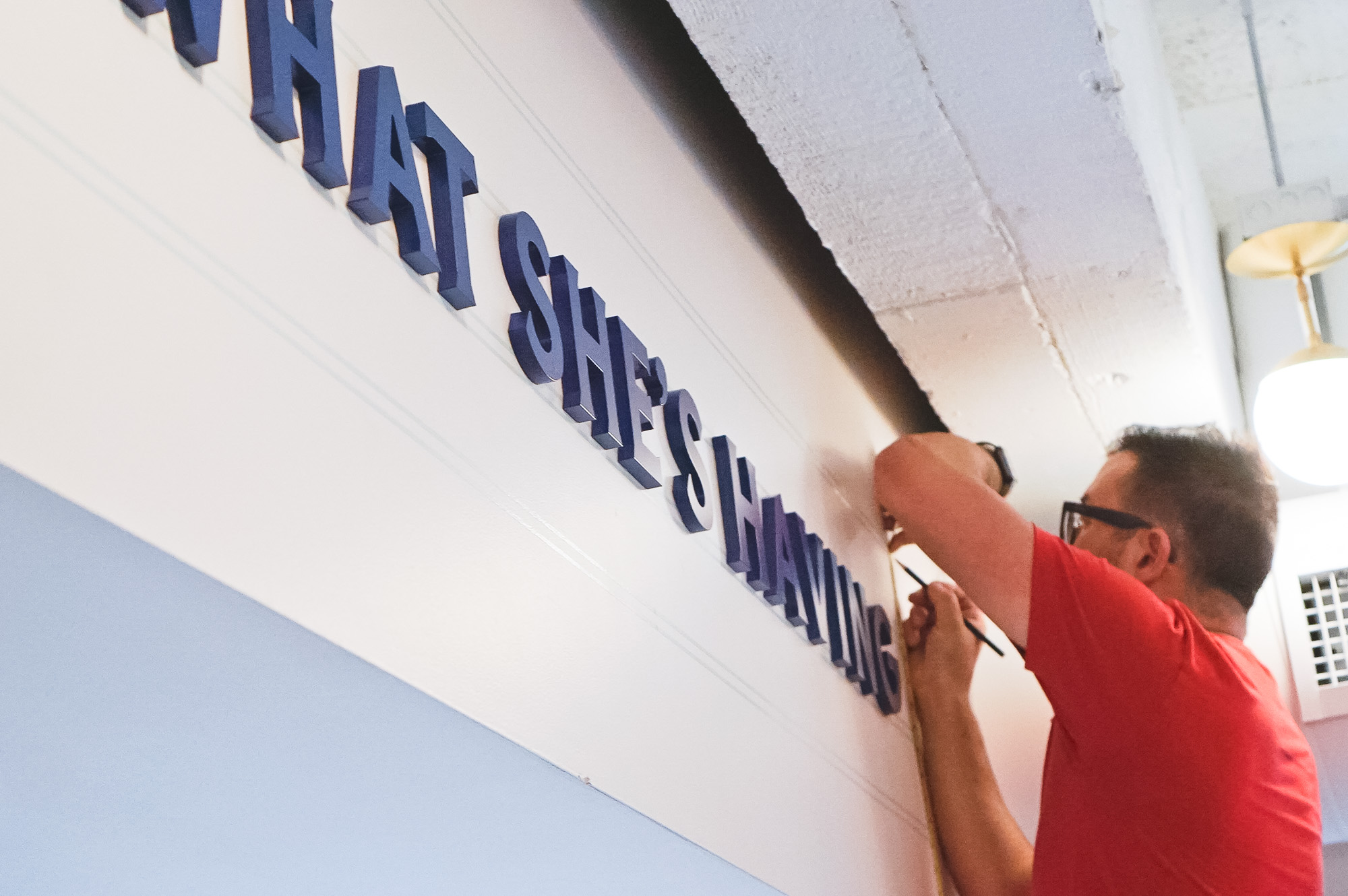
THE SOLUTION
A cohesive signage system that speaks to their brand, and can expand as they grow.
The signs we made met The Wing’s high design standards while still being easily replicated, replaced, or changed to keep up with their fast-growing brand. We made sure that the signs are durable enough to stand up in a community space, yet look like they are executed with a light hand.


“Thank you for all your incredible work and for making our space so special.”
—Isabel McWhorter-Rosen, Social Media Associate at The Wing
SUMMARY
SHARE
Background
- Client: The Wing
- Location: San Francisco and Los Angeles
- Size: 8,000 sq ft
- Type: Co-working space
- Date: October 2018
Services Provided
- 3D renderings and technical drawings
- Consultation
- Sign fabrication
- Full installation
- Post installation support
Techniques used
- 23k gold leaf gilding
- Laser cutting
- UV printing
- Water jet cutting
- Vinyl cutting
[addtoany]
SCOPE OF WORK

“W” for The Wing, Williamsburg

The Wing San Francisco Wayfinding

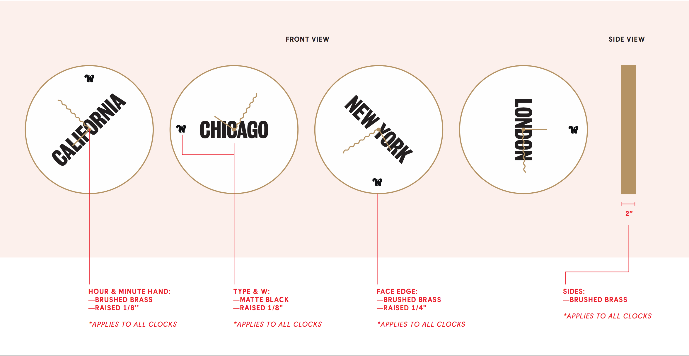
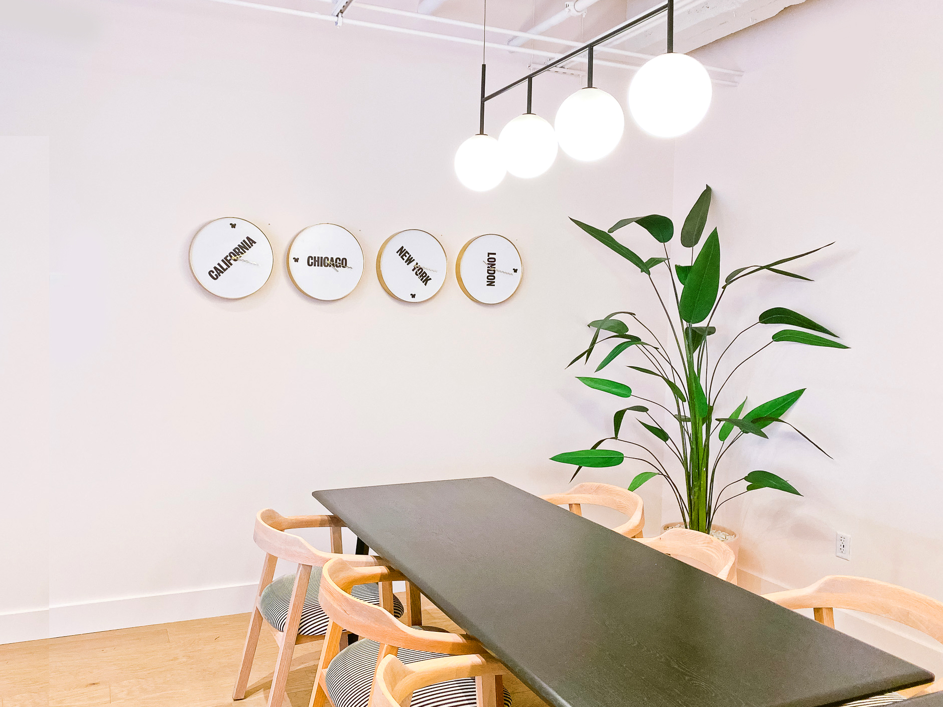
The Wing Clocks

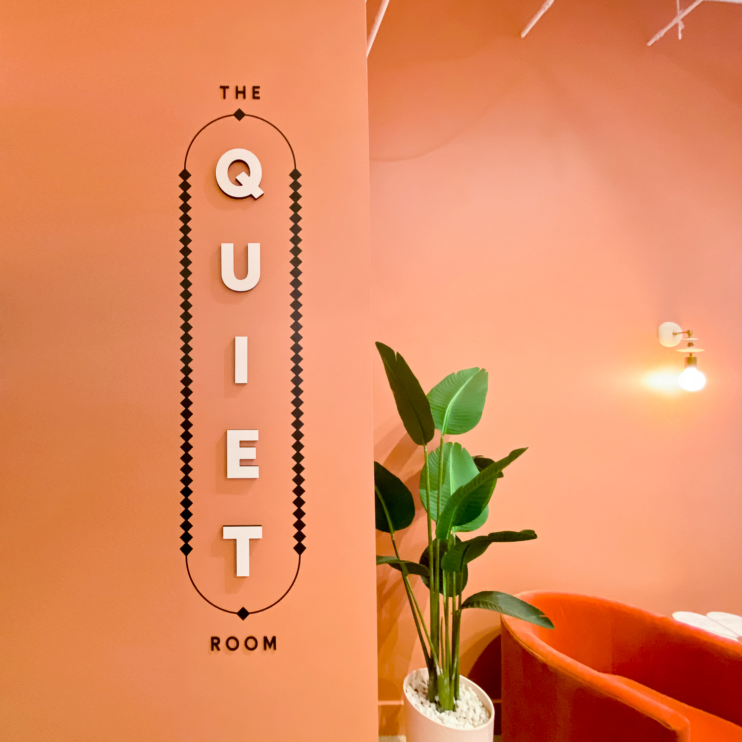
The Wing SF – The Quiet Room

The Wing Los Angeles, Reception Sign

ADA Signage for The Wing San Francisco

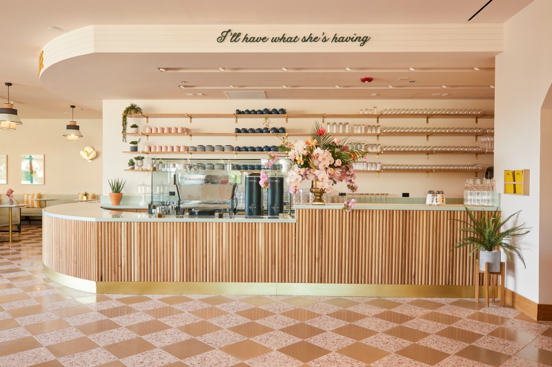
Cafe Sign for The Wing San Francisco

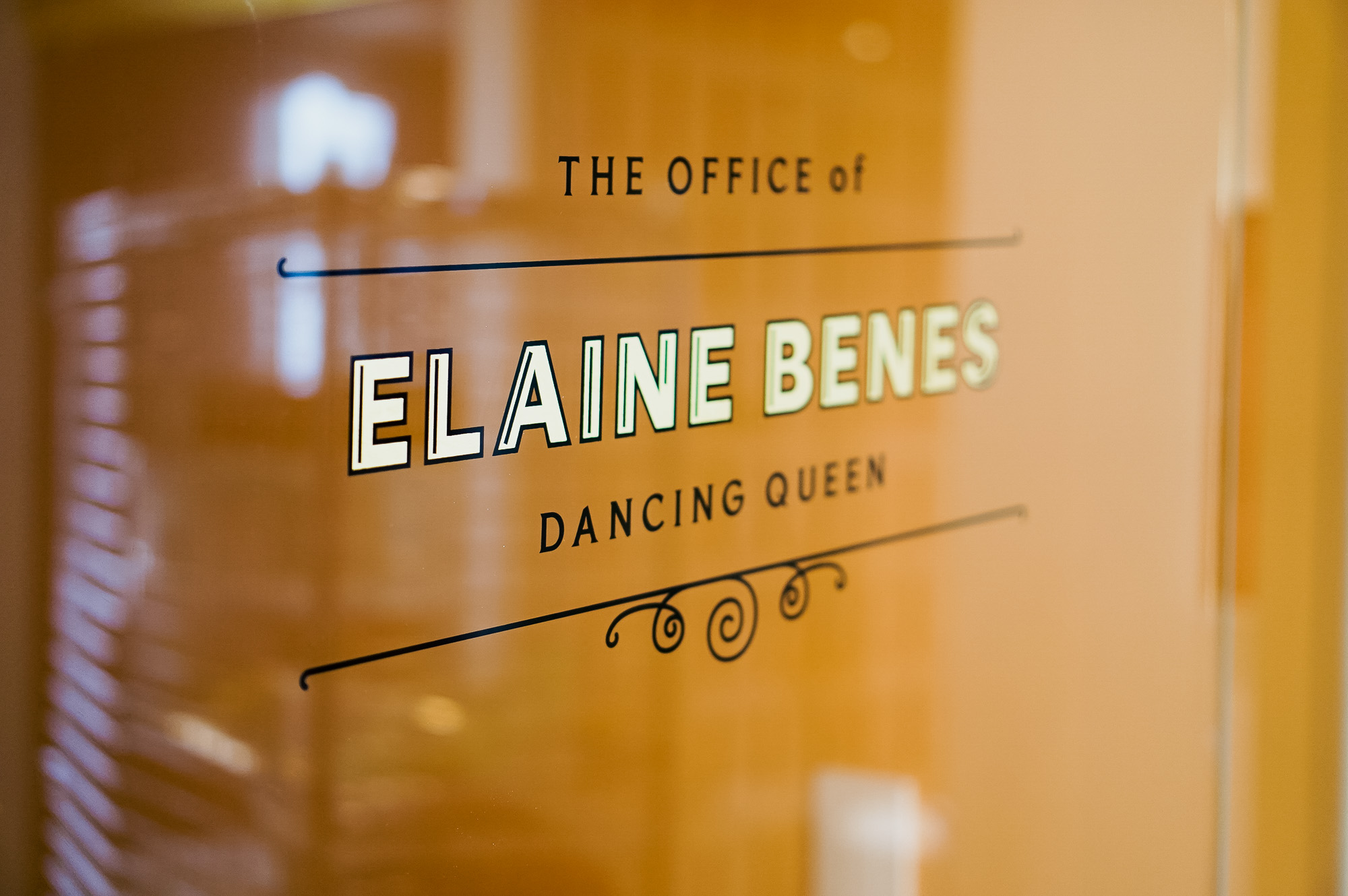
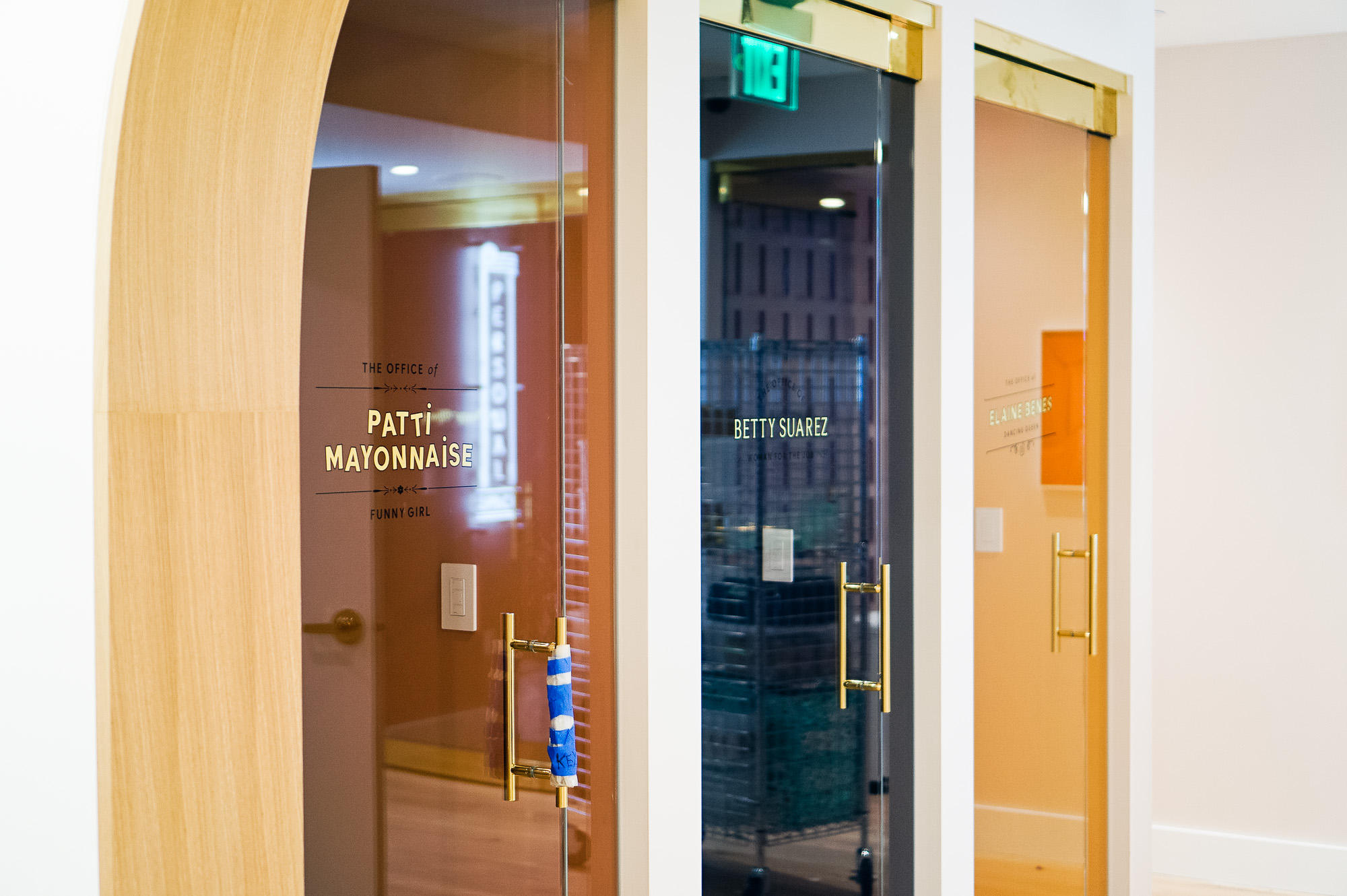
Gold Leaf Glass Door Signage for The Wing San Francisco

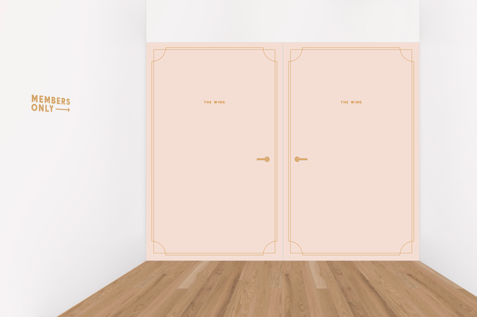
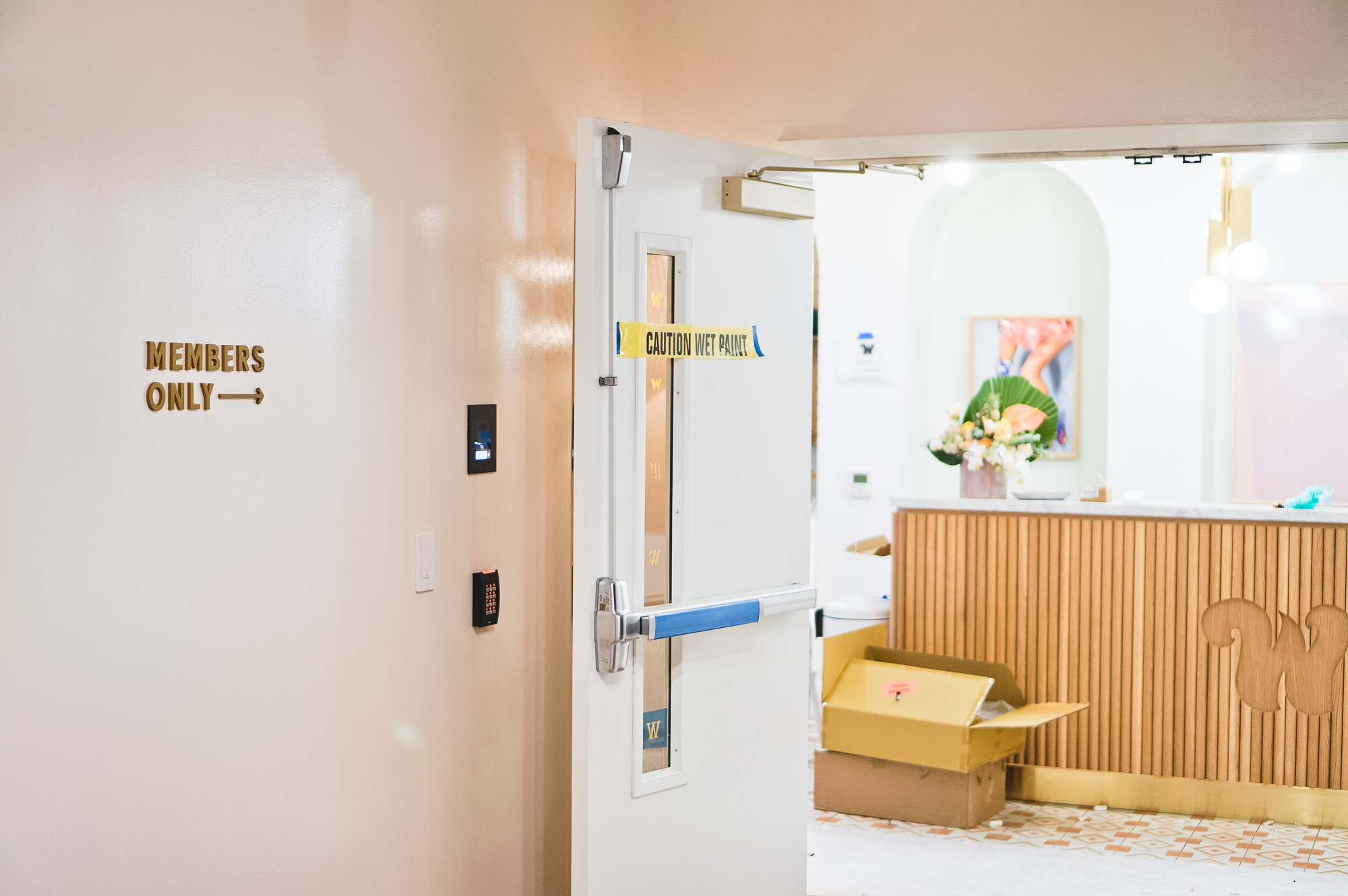
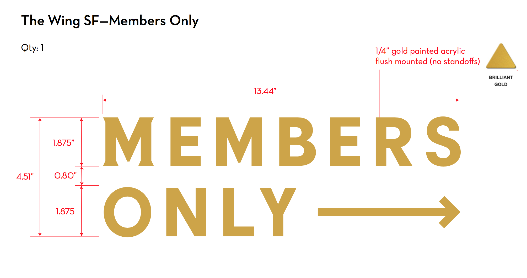
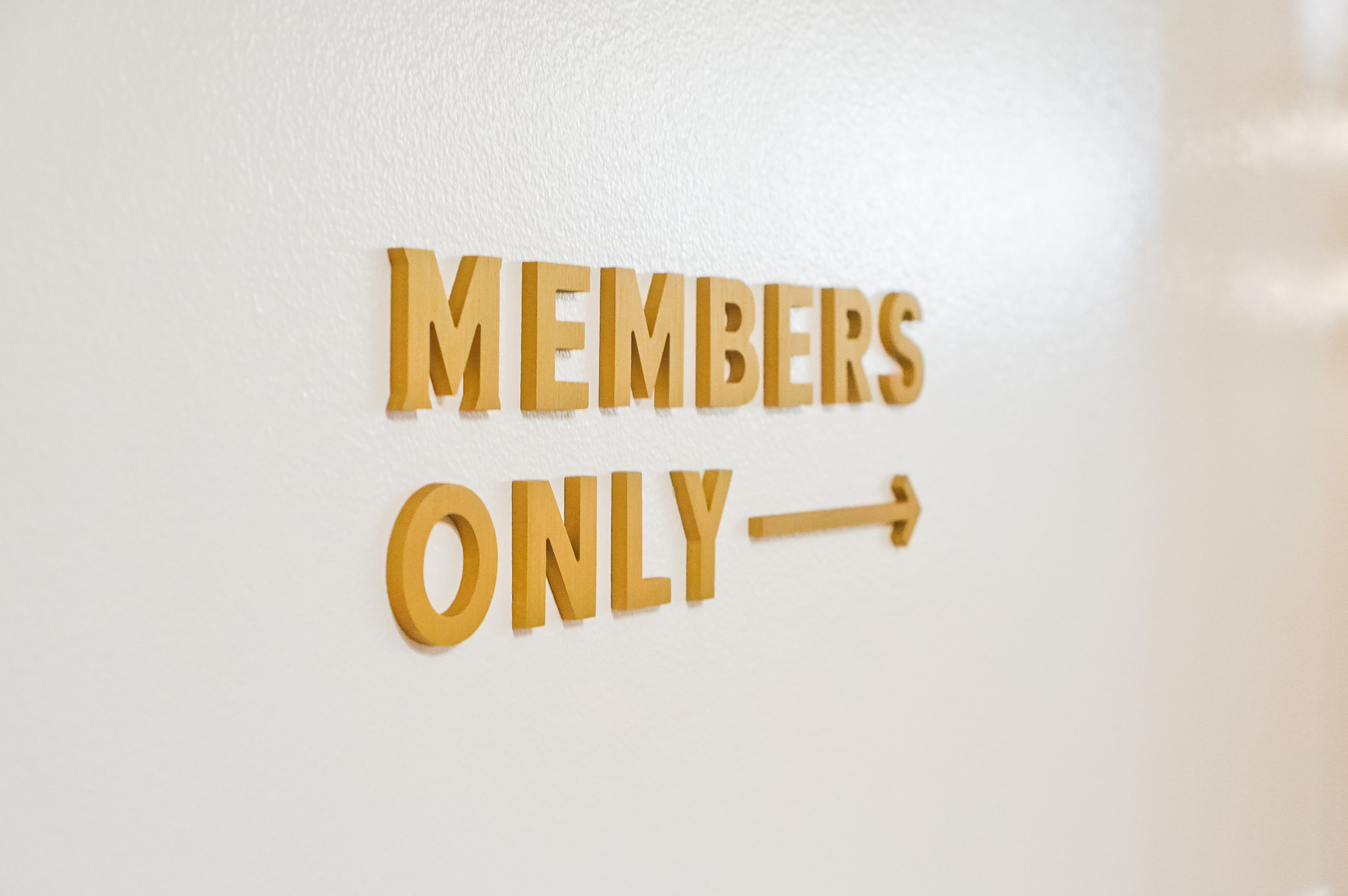
“Members Only” Entrance Sign for The Wing San Francisco

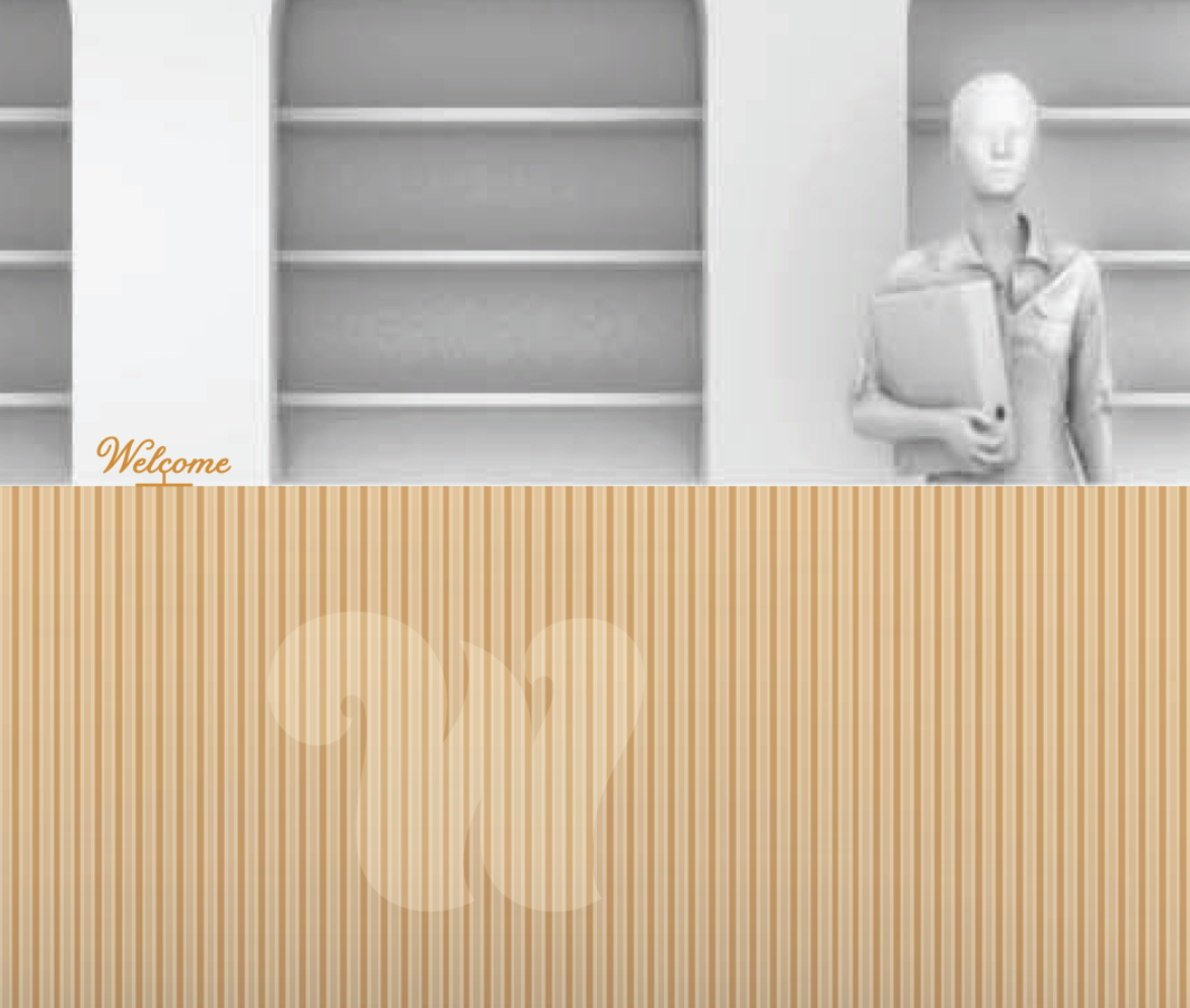
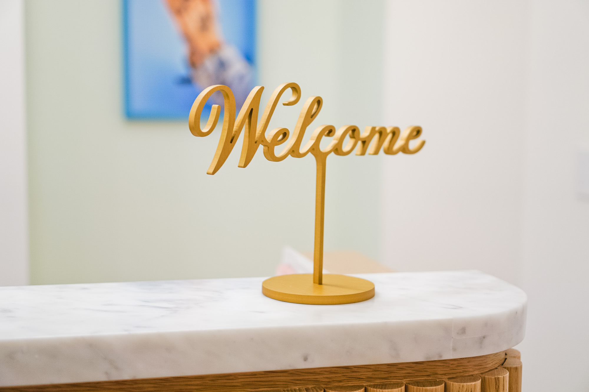
Freestanding Welcome Sign for The Wing San Francisco