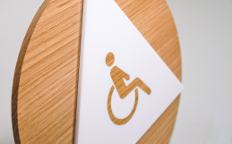
Consider this the Cliffs Notes of rules for ADA compliant text. (Don’t worry, we won’t tell.)
We created this handy cheat sheet to help you design signage that is both on brand and ADA compliant. The three things we’ll go over are:
- Font selection
- Text spacing
- Text size
The main goal here is legibility, so while there is enough flexibility to create a beautifully branded signage system, don’t go too crazy with typefaces or creative layouts (save that for your non-ADA compliant signs)
1. Choose the right font.
Set your text in uppercase, and choose a font that is in an easy-to-read sans serif. Steer away from script, decorative text, or anything that is unusually narrow or wide.
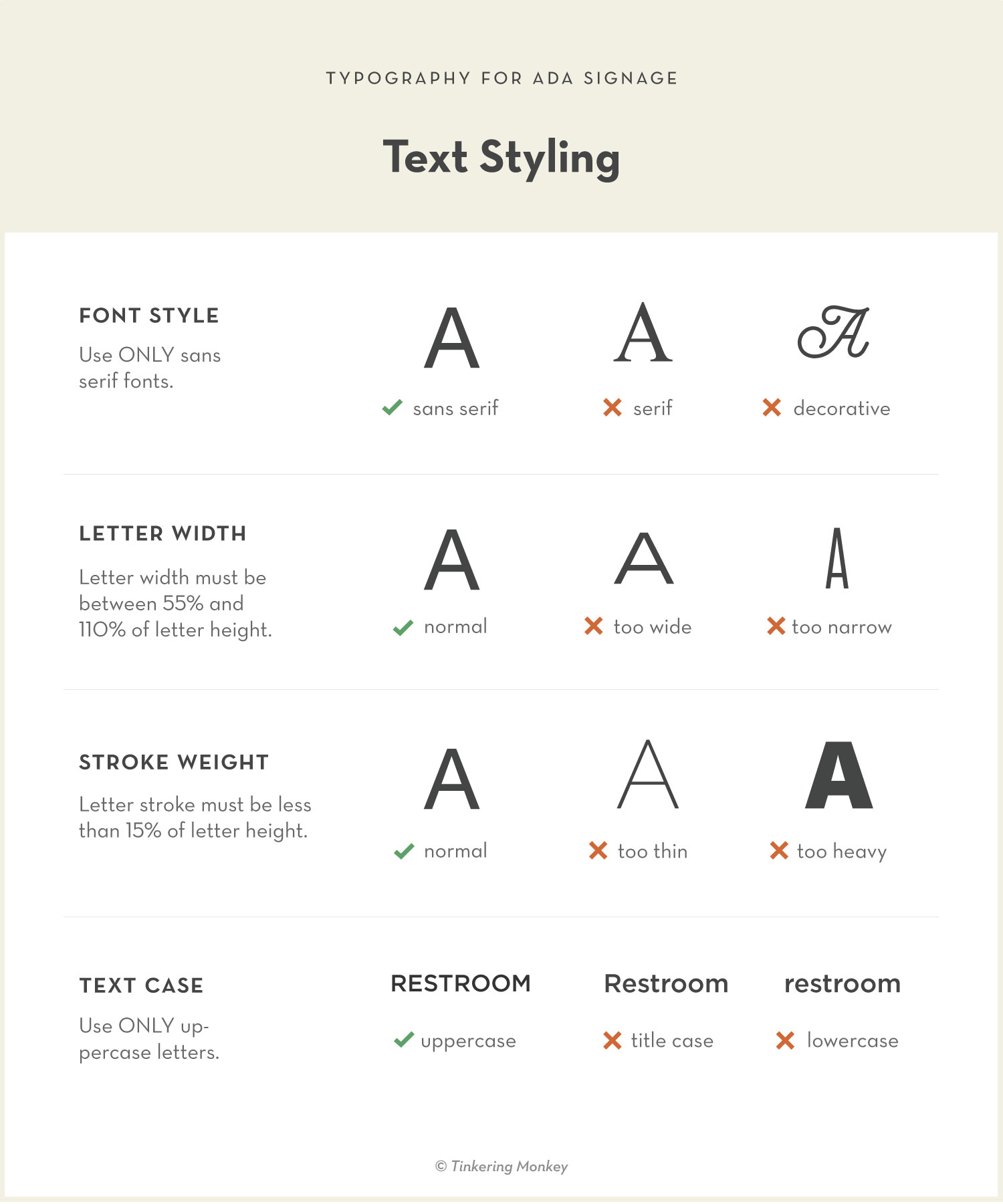
Common fonts used for ADA-compliant signage are classic typefaces such as Helvetica, Futura, or Frutiger. Want something with more style? Try Din, Avenir, or Univers.
2. Give your text some breathing room.
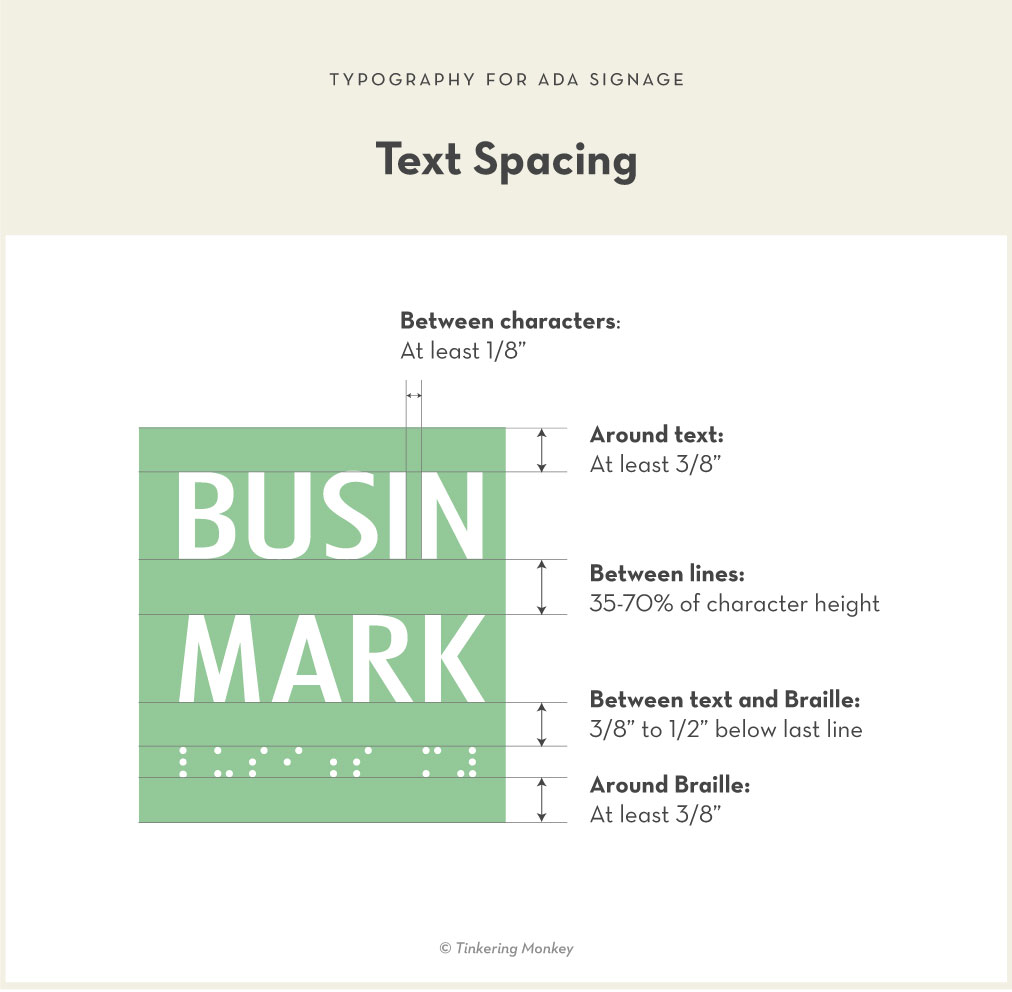
Appropriate spacing around (and within) the text can greatly help with legibility. Keep in mind that the visually impaired will need to feel around the sign for where the text starts and ends. Following standards will help them know what to expect when they’re in a new space.
3. Set your text at the right size.
Text size depends on typical viewing distance of your sign. Most likely your sign will need to have text 5/8″ to 1.5″, assuming it will be mounted at a normal height and read at a normal distance. Refer to the chart below to look up how tall your text should be.
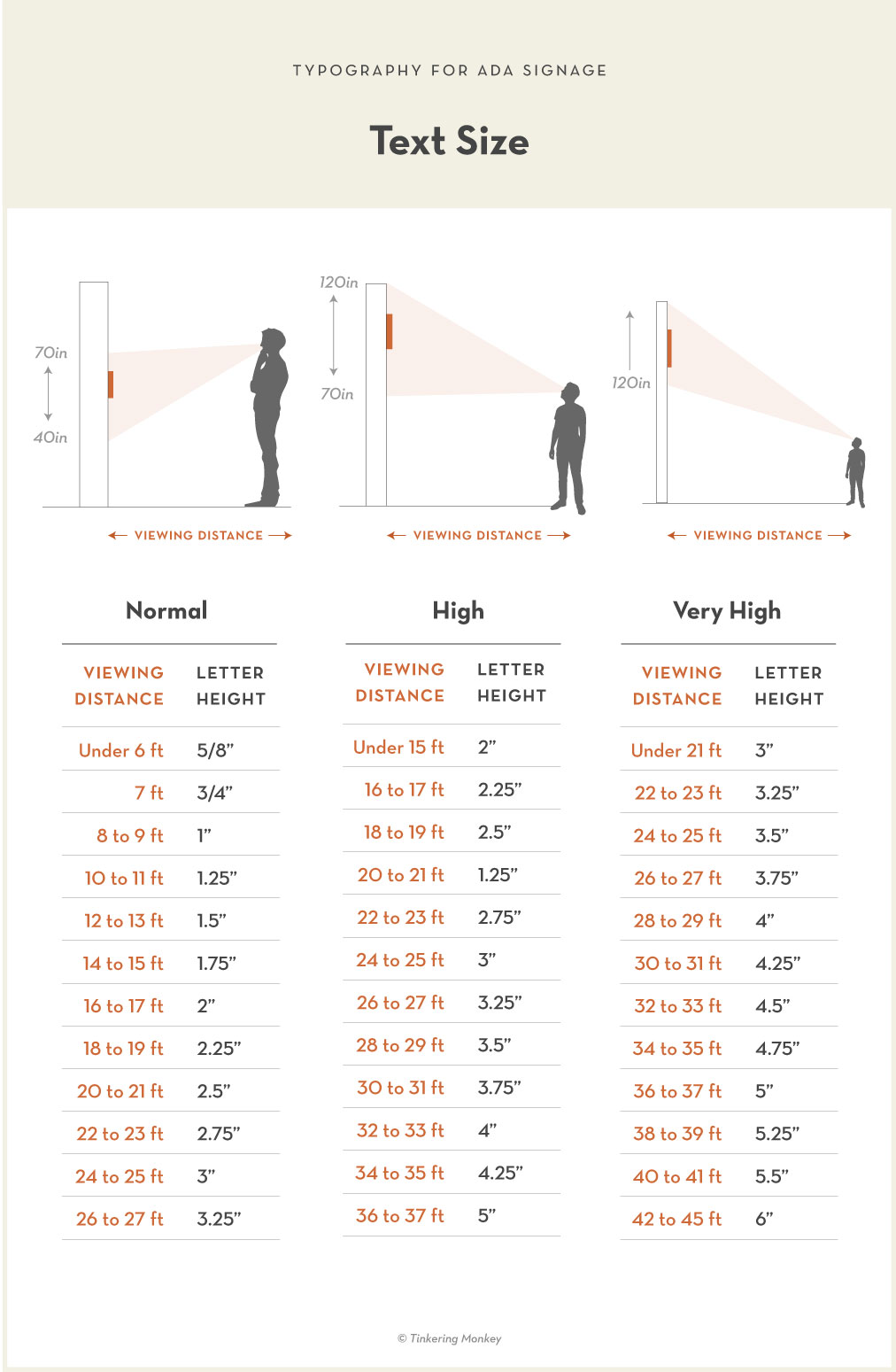
Keep in mind that the higher your sign is mounted, the further away that viewing distance should be, and the larger your text needs to be.
Want us to look over your sign designs?
Send ’em over to hello@tinkeringmonkey.com. We’ll set you in the right direction.
The Lazy Designer’s Guide to ADA Signage
We read 279 pages of the ADA Standards for Accessible Design so you don’t have to. If you found this article helpful, check out the other articles in this guide.


