
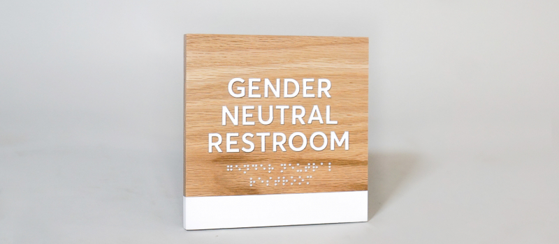
Learn how to add Braille to your signage with this easy, foolproof method.
Step 1: Download and install this font.
To get things started, you’ll need the right font. Most Braille fonts don’t work with Grade 2 Braille. This one does. And we’re giving it to you for free.
Install the font after you’ve downloaded it. If you’ve never done that before, you can refer to these Mac instructions or Windows instructions.
Got the font working? Great! Let’s move on.
DID YOU KNOW?
ADA signage uses a certain type of Braille called Grade 2 Braille.
Since ADA signage requires Grade 2 Braille, it’s important to know what that means. Grade 2 Braille was introduced as a space-saving alternative to standard Braille (Grade 1 Braille).
Grade 2 Braille abandons one-to-one transcription and adds hundreds of abbreviations and contractions, making it easier to fit on signage.

One of the contractions available is “st”. In this example, the Braille character for “s” and “t” has been replaced by a single, new character representing “st”.

Step 2: Translate your text into a contraction.
Now that you know what Grade 2 Braille is, it’s time to find the contracted version of your text. Go to the Braille Translator and type in your text in lowercase (unless your text includes proper nouns or acronyms).

This result shows a contraction exists for “st” in Grade 2 Braille. This has been substituted by the “/” symbol, which will be replaced with a special “st” character when you use the Braille font you just downloaded. Keep in mind that not all words have contractions.
Note: Contractions can’t be used when the word is made up of two words. So a(wh)ile is OK, but ra(wh)ide is not. The translator unfortunately won’t catch this.
Step 3: Copy and paste that translation into Adobe Illustrator.
Copy and paste the contracted text into Adobe Illustrator. Then, set the text to your newly downloaded Swell Braille font, and enter in these character and line spacing numbers. (30 is the magic number here).

(Curious why it’s called “Swell Braille”? Other than being cool in a 1930s kind of way, it’s also meant to be used with tactile graphics machines that emboss on Swell Paper.)

If you followed the settings above, you should meet these ADA size and spacing requirements. But it’s always good to double check—especially the first time around.
Step 4: Turn your text into artwork.
Before sending your file to production, turn your editable text into flat artwork. This avoids your text being replaced by a default font if your sign manufacturer doesn’t have Swell Braille (which will most likely happen).

Step 5: Position your text correctly.
The last step is to make sure that your Braille is properly placed on the sign. Not only does all the text need to be grouped together, but there needs to be enough negative space around the Braille, so the reader is not confused by nearby sign elements.


The Lazy Designer’s Guide to ADA Signage
We read 279 pages of the ADA Standards for Accessible Design so you don’t have to. If you found this article helpful, check out the other articles in this guide.


THANK YOU!
First time creating ADA signage and after receiving the ADA Standards guide, I kinda freaked out.
Found this page while looking for a braille font and it was an incredible help. Almost made learning about it fun.
I am bookmarking and will recommend to anyone who needs to know.
AGAIN, THANKS!
Barry Arnold